UX Designer Resume
A design resume fails for a different reason than a technical one: the work is visual, but the document still has to survive a parser that cannot see anything. Below is a UX designer resume example built around case studies, the sections hiring managers look for, and the research, systems and accessibility keywords that carry weight with design teams.
Free forever. No account, no card, no catch — your data never leaves your device.
What a UX designer resume must include
- A headline that names your split — product designer, UX researcher, or a designer with front-end reach — rather than the bare job title.
- A portfolio link in the first screen of the document, not buried near the footer.
- Case-study summaries written as problem, constraints, research, iterations, outcome — one line each.
- Outcomes expressed as numbers you actually measured: task success, completion time, conversion, support volume.
- A skills block grouped so a reader can see research, craft, systems and accessibility competence at a glance.
The portfolio is the real application; the resume is its index. Hiring managers use the document to decide whether to open your case studies, so every line should point at evidence you can defend in a walkthrough.
How to structure a case-study entry
- Problem — the user or business problem in one sentence, plus the constraint that made it hard.
- Research — what you ran (interviews, usability tests, analytics) and what it changed about the direction.
- Iterations — how many rounds, and what you cut or kept after testing.
- Outcome — the measured result, and what you would do differently next time.
- Your role — say plainly whether you led, partnered or supported; reviewers can tell when a case study has three authors.
Keep the resume entry to one or two lines and put the detail behind the portfolio link. “Cut intake abandonment 27% after twelve usability sessions” is enough to earn the click; the case study is where the process lives.
UX Designer Resume Example
Example resume
A single-page, ATS-safe product design resume. Case-study lines stay short and the portfolio carries the depth — switch templates and export PDF or DOCX without an account.
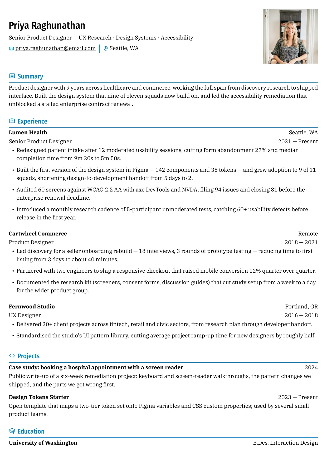
Showing 3 of 15 free templates — open the builder to browse every layout. All 15 are free.
Recommended sections for an ux designer resume
- Summary — 2–3 lines: your specialty, years in the craft, and one measured outcome.
- Experience — reverse chronological, with a case-study line under each role.
- Selected case studies — two or three with a link and the outcome, so the portfolio is one click away.
- Skills — grouped by research, design craft, systems and accessibility.
- Education and credentials — your degree if you have one, plus any relevant certification; most UX roles do not require a license.
Writing experience bullets that carry weight
- Weak: “Responsible for user research and wireframes.” Strong: “Ran 14 moderated sessions that killed a navigation concept before engineering spent a sprint building it.”
- Weak: “Improved the design system.” Strong: “Grew the Figma library from 20 to 142 components; adoption reached 9 of 11 squads in two quarters.”
- Weak: “Worked closely with developers.” Strong: “Paired with two engineers on a token migration that cut handoff cycles from five days to two.”
- Weak: “Made the product more accessible.” Strong: “Closed 81 of 94 WCAG 2.2 AA issues found in an audit across 60 screens.”
A bullet without a number is a claim; a bullet with a number is evidence. When you never measured the outcome, measure the scale instead — how many users, screens, sessions or teams were affected.
UX designer skills keywords
Lead with the tools you would be expected to use in your first week: a research and testing suite, a design tool, and the systems or accessibility tooling that matches the job description. Mirror the wording of the job ad where it is genuinely true of you.
- Design tools: Figma, FigJam, Sketch, Adobe Creative Suite, Framer, prototyping, auto layout
- Research methods: moderated and unmoderated usability testing, interviews, surveys, card sorting, tree testing, diary studies
- Research platforms: Maze, UserTesting, Dovetail, Optimal Workshop, Lookback
- Analytics: Amplitude, Mixpanel, Google Analytics, Hotjar, funnels, cohorts, session replay
- Design systems: design tokens, component libraries, Storybook, Zeroheight, contribution models
- Accessibility: WCAG 2.2 AA, axe DevTools, WAVE, NVDA, VoiceOver, contrast analysis, focus management
- Collaboration: Jira, Linear, Notion, Confluence, Miro, critiques, agile delivery
Name your research and craft split
Design roles are advertised across a wide band, from research-heavy to interface-heavy, and hiring managers screen for the half of the job you actually want. State it in the headline and the summary — “UX researcher” and “product designer” are read differently — then put the evidence for that half in your first two bullets.
Accessibility belongs on the resume
- Name the standard you worked against, usually WCAG 2.2 level AA. Obligations and legal requirements vary by jurisdiction and by contract, so describe what you did rather than claiming blanket compliance.
- Say how you tested: keyboard-only passes, screen readers such as NVDA or VoiceOver, automated scanners such as axe DevTools.
- Give the scale — how many screens or components, and how many issues you closed.
- List accessibility as a skill like any other, because many job descriptions filter on the term.
How an ATS reads a design resume
- Skill bars, star ratings and radar charts mean nothing to a parser. Write proficiency as text — “advanced”, “5 years” — or leave it out entirely.
- Do not put essential content inside an image. A portfolio spread exported as a picture is invisible to the parser and awkward for a recruiter reading on a phone.
- Avoid a decorative two-column layout with a narrow sidebar; parsers often read straight across the columns and produce scrambled sentences.
- Use standard headings — Experience, Education, Skills — instead of creative labels like “The Journey”.
- Keep the file as DOCX or a text-based PDF, and check that you can select every line before you submit it.
The free ATS checker on this site scans your document for exactly those structural problems and shows you what was read, in your browser, without uploading anything.
A portfolio review never reaches the case studies if the resume behind it parses as scrambled text. ShitResume applies one linear document structure to every template, so research methods, systems work and accessibility wins reach the parser in the same sequence they reach the eye. The builder is completely free and needs no account, and it runs in the browser — which suits designers who would rather not hand their career history to another sign-up form.
Portfolio links and NDAs
Link the portfolio in the header and again under the most relevant role, and use a URL you control. When your best work is under NDA, publish the process without the confidential artefacts: the research plan, the constraint, the number of iterations and the outcome usually say more about your judgement than the final screens do. Never make a password-protected link the only path to your work.
ShitResume does not charge for templates or exports, and the resume is rendered in the browser, so your employer list and metrics are never stored on a server. No account, no card, no trial. Keep one ATS-safe version as the index for your portfolio, export the PDF when a role opens, and let the case studies do the persuading.
Skills and keywords for this role
Use the terms that genuinely describe your work — an interviewer will ask about anything you list.
- Design tools: Figma, FigJam, Sketch, Adobe Creative Suite, Framer, prototyping, auto layout, design tokens
- Research methods: moderated usability testing, user interviews, surveys, card sorting, tree testing, diary studies
- Research platforms: Maze, UserTesting, Dovetail, Optimal Workshop, Lookback
- Analytics: Amplitude, Mixpanel, Google Analytics, Hotjar, funnel analysis, cohort analysis, session replay
- Design systems: component libraries, token architecture, Storybook, Zeroheight, contribution models, documentation
- Accessibility: WCAG 2.2 AA, axe DevTools, WAVE, NVDA, VoiceOver, color contrast, focus management, keyboard testing
- Collaboration: Jira, Linear, Notion, Confluence, Miro, design critiques, agile delivery
Frequently asked questions
How do I show UX work when my portfolio is under NDA?
Describe the process and the outcome, and leave the confidential screens and data out. You can still name the problem, the methods, how many rounds you ran and the measured change. Reviewers in healthcare, fintech and government work see this constantly; what they will not accept is a case study with no evidence of your judgement in it.
Do UX designers need a degree?
Many job ads treat a degree as preferred rather than required, and a portfolio usually carries more weight than a transcript. Degrees that help are interaction design, human-computer interaction, psychology and graphic design. Coming in from another field is common, so lead with the case studies and the outcomes you measured.
How many case studies should a portfolio have?
Three or four deep case studies usually beat a wall of thumbnails. Choose work that shows range: one end-to-end project with research, one focused on interface craft, and one that demonstrates systems or accessibility thinking. Depth is the point — a reader should see how you made decisions, not only the final screens.
Where should the portfolio link go on the resume?
In the header beside your name and contact details, and again under your most relevant role. Assume the reader skims the top third first. If you use a personal site, keep the URL short, and open it on a phone, because plenty of first looks happen on a small screen.
Is a UX certification worth listing?
It helps when it shows something specific, such as an accessibility credential like IAAP CPACC or WAS, or a research-focused program. Most UX roles require no certification at all, and none of them substitutes for portfolio evidence. If you list one, put it with your education and keep it to a single line.
How do I describe research work if I am applying for a UI-focused role?
Keep the research bullets but shorten them, and lead with what the research changed. Two lines — the method and the decision it drove — is usually enough, then give the space to craft, interaction detail and systems work. The same project can be written two ways, so rewrite the bullets for each role instead of sending one version everywhere.
What metrics should a UX designer put on a resume?
Whatever you genuinely measured: task completion rate, time on task, error rate, conversion or drop-off, support ticket volume, or the number of accessibility defects closed. A System Usability Scale score is a 0–100 number where higher is better, and teams normally compare it against their own earlier version rather than a fixed pass mark. If you only tracked the scale of the work — participants, screens, squads — use that.